RSS

Monthly Archives: May 2026

Good Reviews Are Conversations

   Q: How do you know if a programmer is an extrovert?

   A: They look at your shoes when they talk to you.

I can say that, I’m a programmer. And an introvert. 😉 But that’s not the type of conversation I want to write about.

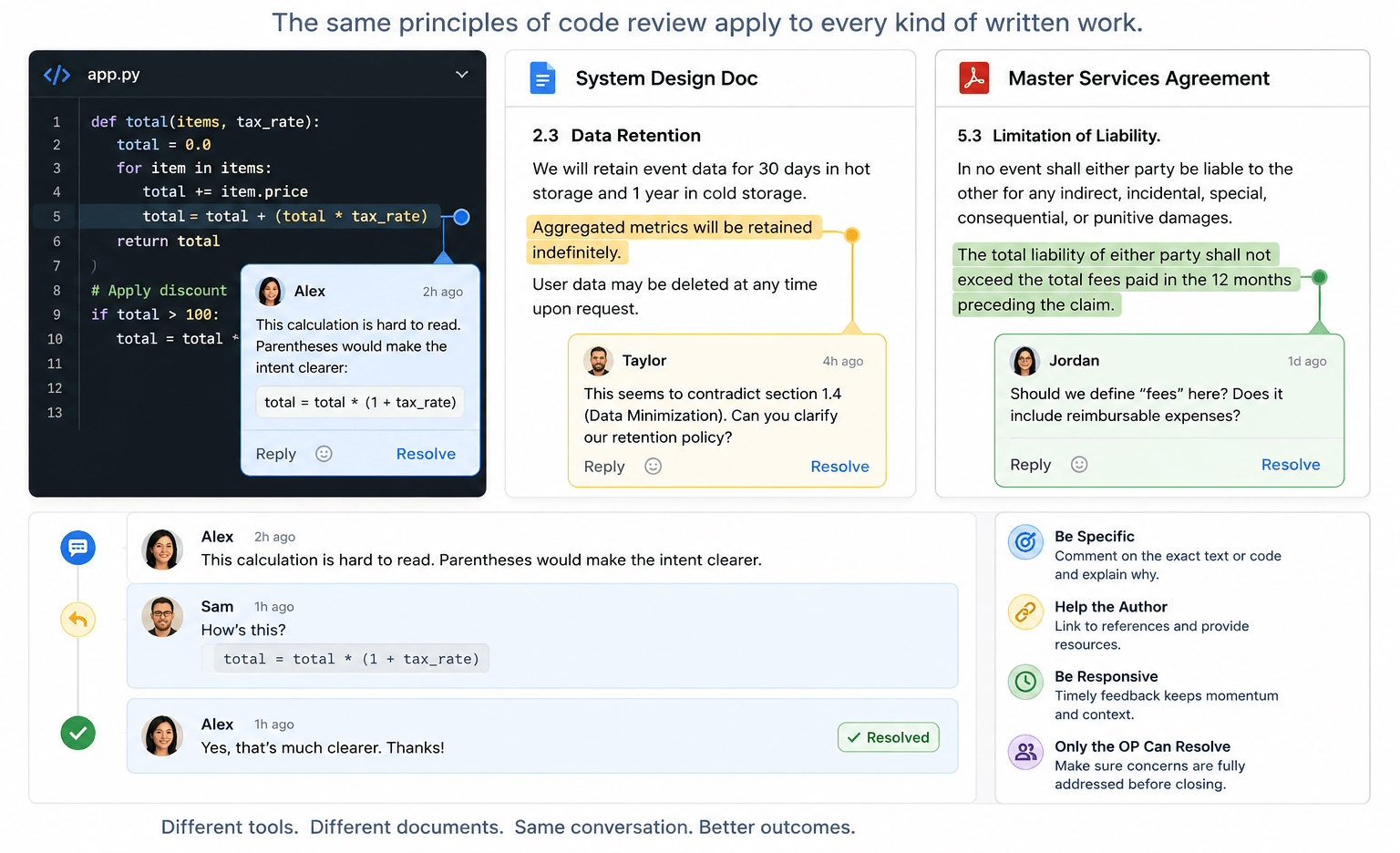
A code review is a conversation: someone asks a question or makes an observation and someone else responds. But it turns out the mechanics of a code review also apply to other types of written feedback. In the past few weeks, I’ve participated in reviewing code, design documents, and contracts. Along the way, I’ve recognized that a few guiding principles can help you get the most benefit out of the review process.

Be Specific

I mean this both in the sense of not being vague (“This seems wrong”) but also not being general. It’s rare that code or prose is so weak it needs to be rewritten from scratch. You almost always have a solid outline and one or more things could stand improvement.

  • In modern source control platforms, you can likely comment on a specific line of code.
  • In Google Docs, Microsoft Word, and such, you generally highlight the text you want to comment on.

Once you’ve picked the code or text to comment on, give specific feedback.

  • “This variable name is inconsistent with our usual style”
  • “I find this hard to read; parentheses would make this calculation clearer”
  • “This sentence lacks the serial comma that is recommended in our style guidelines”
  • “This seems to contradict section 2.3 earlier in the document”

Critique the Work, Not the Author

Good review comments focus on the artifact, not the person.

Weak: “You clearly didn’t think about edge cases here.”

Better: “It’s not clear to me what happens if the input list is empty.”

The distinction matters. The first version invites defensiveness; the second invites collaboration. Remember, the goal is to improve the work, not win the argument.

Help the Author

If there is an external authority (a style guide or RFC or Wikipedia entry) that supports your argument and gives the author resources, link to it. (If no such reference exists, consider if your comment is going to improve the code or text, or just satisfy your own style bias.)

Be Responsive

Distributed teams thrive on the asynchronous nature of cloud-based feedback loops. But the feedback needs to be timely. I’ve come back to a conversation that has languished and wondered, “What was I trying to say here?” Your team may be in different time zones or on different schedules so feedback in minutes or even hours may not be practical. But if your feedback cycle is measured in weeks, you’re probably spending too much time getting back up to speed as you dig in again.

Only the OP Can Resolve a Conversation

Only the original poster knows with confidence that their concern has been addressed. If the reviewer is confused, the author can’t just rewrite it and assume it is now clear! Waiting for the reviewer to acknowledge that their concern has been addressed may be the most important contribution to the success of the review.

Weak

  • Author: Would you look at this?
  • Reviewer: This paragraph is hard for me to follow.
  • Author: I rewrote it. (And resolves the conversation.)

The author has no way to tell if the new text is clear to the reviewer.

Better

  • Author: Would you look at this?
  • Reviewer: This paragraph is hard for me to follow.
  • Author: How’s this?
  • Reviewer: Yes, I understand. Thanks. (And resolves the conversation.)

Challenge: Do you see the bug in the Python code in the image at the top of this post?

 
Leave a comment

Posted by on May 27, 2026 in Uncategorized


Tags: ,

Compounding Interest in UI: Why Seconds Matter at Scale

Making things easy is hard.

But I often tell developers that extra time spent making software easier to use is time well spent. If an hour or two of development saves users 10 seconds thousands of times, the net gain of time spent just grows more and more valuable the longer the software is in use. Not to mention that an attractive, informative, frictionless UI makes a great impression on your user.

So, where can you spend your time to make your UI help your users save time?

Be Consistent

Users come to your software with experience and expectations. They “know” that a magnifying glass indicates search. Without a good reason to do something else, be consistent with industry standards. But if you have reason to be distinctive, at least be consistent across parts of your system.

“Any Standard Is Better Than No Standard”

Be Specific

They say 90% of programming is error handling. (The other 90% is user interface.) A lot of that is defensive programming that keeps your software running in unusual circumstances. But some of those circumstances are not so unusual. And if the program knows something that would help the user, it should be communicated to the user. I’ve been guilty of writing code that handled several errors by responding with a message like “Error: Could not complete operation.” And I’ve been the victim of code like that, too. I ask “Why? What ‘error?'”

Lately, I’ve found AI programming support to be a great help here. Where I may have had code like:

// Validate, then apply change.
if (firstConditionNotMet()
|| secondConditionNotMet()
|| thirdConditionNotMet())
return -1, "Something went wrong."

DoSomething()
return 0, "Success."

I can highlight it or point to it and have an AI coding agent turn it into something like:

if (firstConditionNotMet())
return -1, "Condition 1 not met; unable to apply change."
if (secondConditionNotMet())
return -2, "Condition 2 not met; unable to apply change."
if (thirdConditionNotMet())
return -3, "Condition 3 not met; unable to apply change."
...

The agent often generates better messages than that but just the mechanical restructuring gives me a place to compose better messages. And this code also returns more specific error codes for the calling function to handle.

Let the AI do the grunt work of creating the scaffolding so you can focus on the messages.

Be Supportive

Roughly 5% of the population has “color vision deficiency” and more have some other form of vision impairment. A first draft of a new UI we created recently had state indicated by colored circles:

  • 🟢= all good
  • 🟡= might need attention
  • 🔴= not good

But we heeded the maxim that you should not use only color to convey information in our UI and undertook a refinement. We kept color but added shapes.

  • ✅
  • ⚠️
  • ❌

All convey a positive connotation in two dimensions: shape and color.

And we added a grey circle⚪for when no reliable state information was available. We support colorblind users with shapes but we don’t stop there.

The important word in “don’t use only color to convey information” is “only.” A rich UI has more than one dimension.

Bonus: Be Grammatical

This is more about making a good impression than making the UI easier to use, but it doesn’t hurt to impress your users.

I find a message like “3 change(s) applied” to look unpolished. And it gets worse when you’re dealing with an irregular noun: “3 policy(s) updated.” But the technique of generating specific error messages that was described above can be applied to creating specific success messages. An AI can help you restructure:

msg = "{n} changes applied."

into

switch n {
0: msg = "No changes applied."
1: msg = "1 change applied."
default: msg = "{n} changes applied."
}

Again, let the AI take a crack at it and refine the messages if you need to. (But you might be surprised how well the agent knows plurals.)

 
1 Comment

Posted by on May 5, 2026 in AI, Software techniques


Tags: , , ,